Posts

Showing posts from October, 2018

11. Game Accessibility Guidelines

As a part of the research in making this game more inclusive and accessible, I'm going to look through the Game Accessibility Guidelines and try to implement as much of it as I can in my game, taking into consideration the limited time frame and resources. What are these guidelines? The Game Accessibility Guidelines document is a living (open to updates and improvements) set of guides created by a large group of professionals in various fields of game design, technology,  and accessibility research. There are three categories - Basic, Intermediate, and Advanced. The guidelines attempt to balance Reach, Impact, and Value, and are grouped into sub-categories relating to different types of skill or impairment. For my project, I'll be looking through the Basic guidelines and see which ones I can feasibly apply to my game. 1. Motor - Remapping, or allowing users to change the game controls, is one of the most common accessibility issues. I've never tried to make a gam

10. Past Winning Entries of IxDA (Part 2)

Image
Continuing my dive into the past winners of the Connecting Category of the IxDA 2014 Winner - KonneKt: a social game for isolated children in the hospital by Delft University of Technology (Student work) KonneKt is another example of good interaction design that goes beyond a screen. By using EVA foam pieces, magnets, and suction cups, Job Jansweijer turned a glass barrier into a medium for interaction for children in hospitals who had to be isolated for their health. Job saw the issue of how children under isolation in hospitals were unable to engage in social play, and sought to create a solution that could help them interact with the outside world in a safe and fun manner.  Media: Craft foam, magnets, suction cups Interaction: Children and adults are able to use the KonneKt pieces to build on the glass, and people on both sides of the glass are able to participate.    Connecting: Children who spend extended amounts of time isolated in hospitals with the outside world

9. What NOT to Say

Image
I'm going to start this project by prefacing that I am in fact, not someone who is handicapped. I come from a position of privilege, and I don't want to impose my ideas on what handicapped life is like on anyone. BBC Three has helpfully made a video titled Things Not To Say To Someone Who Uses A Wheelchair In the video, wheelchair users voice their annoyance at condescending or overly-intrusive comments they get from people in their lives. Some key examples of annoying comments shown in the video are: 1. What happened to you? - It's kind of not everyone's business. They don't need to know. 2. You're so brave - They're people. Not all of them want to be heroes for existing and living 3. Do you work? - As opposed to "What do you do?", and people assuming people in wheelchairs can live off government benefits easily 4. How do you have sex? - Why. Why do people ask this. Why do they need to know? 5. That's awful, I'm so sorry -

8. Past Winning Entries of IxDA (Part 1)

Image
The IxDA, or Interaction Design Awards , was founded by a group called the Interaction Design Association . The awards were founded to "celebrate design thought leadership and innovation around the globe". Each year, the awards are meant to showcase how design is able to impact and improve human lives. In this  blog post, I intend on examining past winners and some of the finalists of the Connecting category of IxDA, and seeing what makes them truly extraordinary. 2012 Winner - Pepsi Refresh by Huge Basically HUGE  is a digital agency based in Brooklyn which made a campaign for Pepsi where Pepsi was giving out grants to different people and everyone could place votes on which causes they think the money should go to. It feels so strange knowing the design was created only 6 years ago, but somehow already feels a little dated (I'm sure if I saw this back in 2012 it would have blown my mind). The site refresheverything.com no longer exists, and redirects to Pepsi

7. New Project Idea - Rolling Along?

Image
Initially an idea I thought up for my final year project , I decided to switch it over to this subject because I still want to make it but also prefer another idea for the FYP. I also realised the reason why no one's really made an "Anti-social media" yet - what kind of person would sign up for it? I really didn't fully think that idea through... Anyhow, the title is still a work in progress, but the gist of this new idea is to make a desktop game which puts players in different handicapped scenarios. The first scenario is navigating a busy city in a wheelchair, highlighting the obstacles that most able-bodied people don't think about - stairs, poorly designed ramps, pedestrian lights which are on for too short of a time etc. This is inspired by the Inktober series mentioned in my first post . The player will need to navigate this space within a certain time limit to increase the challenge. Maybe the character will be trying to catch a plane or reach somewhere

6. Formative Assessment - Chosen Project Idea

Image
The main inspiration for this idea was this article by NPR about how a man created an app that chose random public Facebook events for him to attend.  Social media bubbles are a real issue - Facebook and other sites feeds constantly show people content which reaffirm their own beliefs . Very rarely are people exposed to ideas that thy disagree with - unless it's the subject of a viral video which shows the other  as foolish or dumb.  I want to create the proposal for a social media platform that allows and actively encourages people to engage with people who are different from them. This kind of discourse might not be the most comfortable, but it can eventually lead the way towards better understanding.  A very real example of how reaching out could change lives is the story of Daryl Davis , a black man, who spent three decades of his life seeking out members of the white supremacist hate group Ku Klux Klan. Armed with a lot of bravery, and the question "How can

5. Formative Assessment - Chosen Competition

Image
The competition I've decided to work on is the IXDA - the Interaction Awards , under the category of "Connecting". Here's a closer look at the brief and its requirements.  The competition defines its "Connecting" to be something that is "Facilitating communication between people and communities". The competition has been running yearly since 2012. For the 2019 IxDA, the submissions were opened in July, with late submissions up to early October. Shortlisted entries will be announced in November, with the winners announced at the Interaction19 conference in February, in Seattle, USA. To be able to display the artefact at the conference, I would need to be one of the five finalists in the student Connecting category. Being shortlisted also means being able to be included in the Interaction Design Awards Yearbook of that year.  I don't think I'll have issues with Eligibility - To qualify for the 2020 awards, I assume I'll need

4. Trying out the Implicit Association Test (Part 2)

Image
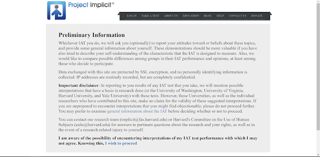
This blog post is a follow up after having completed the skin-tone Implicit Association Test. Part 1 can be found here . In the final section of the test, the participant is told more about their results, how the test works, and steps taken by the researchers to eliminate order effect bias in the test. The participant can also see how they match up to others who have taken part in the test.  At the end of the day, I wasn't too surprised with my test results. I do think that one of the reasons why I have preference to fairer skin is the fact that I myself have fairer skin. I'm also more familiar with people with fair skin since I grew up among family members who look like me. However, I also recognise that culturally fairer skin is still prized above darker skin in East Asian culture. From a young age, the associations of "fair" with "virtuous", "pure", and "beauty" have been deeply etched into my mind, from advertisi

3. Trying Out The Implicit Association Test (Part 1)

Image
Keeping in line with the train of thought of inclusivity, bias, and human connection, I recalled that an episode of the Invisibilia podcast mentioned something called the Implicit Bias Test. After doing a quick search, I found Project Implicit, or the Implicit Association Test , developed by social psychology researchers Anthony Greenwald and Mahzarin Banaji. The purpose of the test was to gauge the difference between self-reported (explicit) bias in terms of factors such as skin tone preference versus implicit bias which might occur in individuals without their conscious realisation. The test measures the speed and accuracy in which a participant can categorise certain traits with certain groups of people - the faster they can associate positive or negative words with certain groups, the stronger the bias they might have for or against that group. I took a few of these tests in one go (skin tone, weight, gender/science), and I went back to the skin tone test to take screenshots to

2. Competition Considerations

Image
While looking through the competitions that Dionysia had shared in the assignment brief, I came across a specific image which really caught my attention and I kept going back to it. What intrigued me was the imagery of the two women, facing each other and laughing, while wearing VR headsets. We don't know what exactly they're seeing. Is it each other? Is it something funny? Are they still interacting with each other in some way? Because of this, I've decided to narrow down my options to competitions which involve the theme of human connection in some way.  These options include: SXSW , which has the theme "Innovation in Connecting People" Interaction Awards (IXDA)  with a category called "Connecting" Finally, I'm including a third option which has more technical categories rather than thematic ones: Core77 Design Awards Following this, I just started writing down keywords, scribbling a flow of semi-connected terms onto paper,

1. Human Centred vs User Centred Design

Image
During the first class of the term, Dionysia showed us some examples of Human-centred design VS User-centred design. This made me think about which approach is better in general. The human-centred design approach considers the multiple facets and aspects of a person's life - ie a user with only one available hand might be just a parent holding a child rather than an amputee. So, when designing with these factors in mind, the designer tries to cater to a wider range of users whose needs might not have been previously considered. However, by choosing to cater to the needs of the many rather than narrowing down to a specific target group, designers risk being too generalist, and their end up unable to address the specific needs of a certain group. Coincidentally, a few days before the class, I came across some sketches made by an artist for Inktober 2016, where he highlights the issues faced by wheelchair users in Malaysia. (linked here ) That very weekend before class, I had be